mothering together
overview
mothering together is a postpartum support platform i've been building since november 2022. it started as ux research and a prototype, became an ai-feature prototype through buildspace in 2024, and launched as a full mvp on april 19, 2026 — 19 days from first commit to launch.
the core idea: new mothers are left to navigate the hardest transition of their lives with a single 6-week follow-up appointment and a pile of fragmented resources. mothering together gives them a companion that's available when they need it most — not during office hours, but at 3 AM.
my background in medical librarianship shaped this from the start. at munson medical center, i spent years helping clinicians find trusted information under time pressure — running literature searches, building retrieval systems, teaching evidence-based practice. postpartum support is the same challenge in a different context: giving someone in a critical moment access to information they can trust. the clinical advisory team includes my partner (emergency medicine physician), my sister (nurse practitioner), and my mother (retired psychiatric nurse).
the problem
maternal mortality rates in the u.s. have been rising for decades. 60% of pregnancy-related deaths are considered preventable. between 10–40% of mothers don't attend their postpartum follow-up. organizations like acog, ahrq, and the commonwealth fund all point to the same structural failure: fragmented care, a single 6-week appointment, and mothers left to figure out the rest on their own.
existing products don't solve this. lifecycle apps like ovia, flo, and glow treat postpartum as the third trimester of a pregnancy app — the mother's recovery sits next to baby sleep guides and cycle tracking. she's secondary context. postpartum-specific apps like postpartum journey focus on tracking and logging, which is useful for recording symptoms but not useful at 2 AM when you need an answer. employer benefits platforms like maven are accessed through employers — most postpartum mothers don't have it, and those who do use it for clinical visits, not for the daily "is this normal?" question.
i evaluated five postpartum-adjacent resources in depth — medlineplus, march of dimes, what to expect, family doctor (aafp), and postpartum support international — across features, content depth, accessibility, and clinical credibility. the gaps were consistent: none covered the full 12 months post-delivery, none offered personalization, none gave mothers direct access to a provider outside of a scheduled visit. medlineplus stopped at 6 weeks. what to expect treated postpartum as a subcategory of baby content. the only resource focused on emotional and mental health (postpartum support international) had no medical review policy.
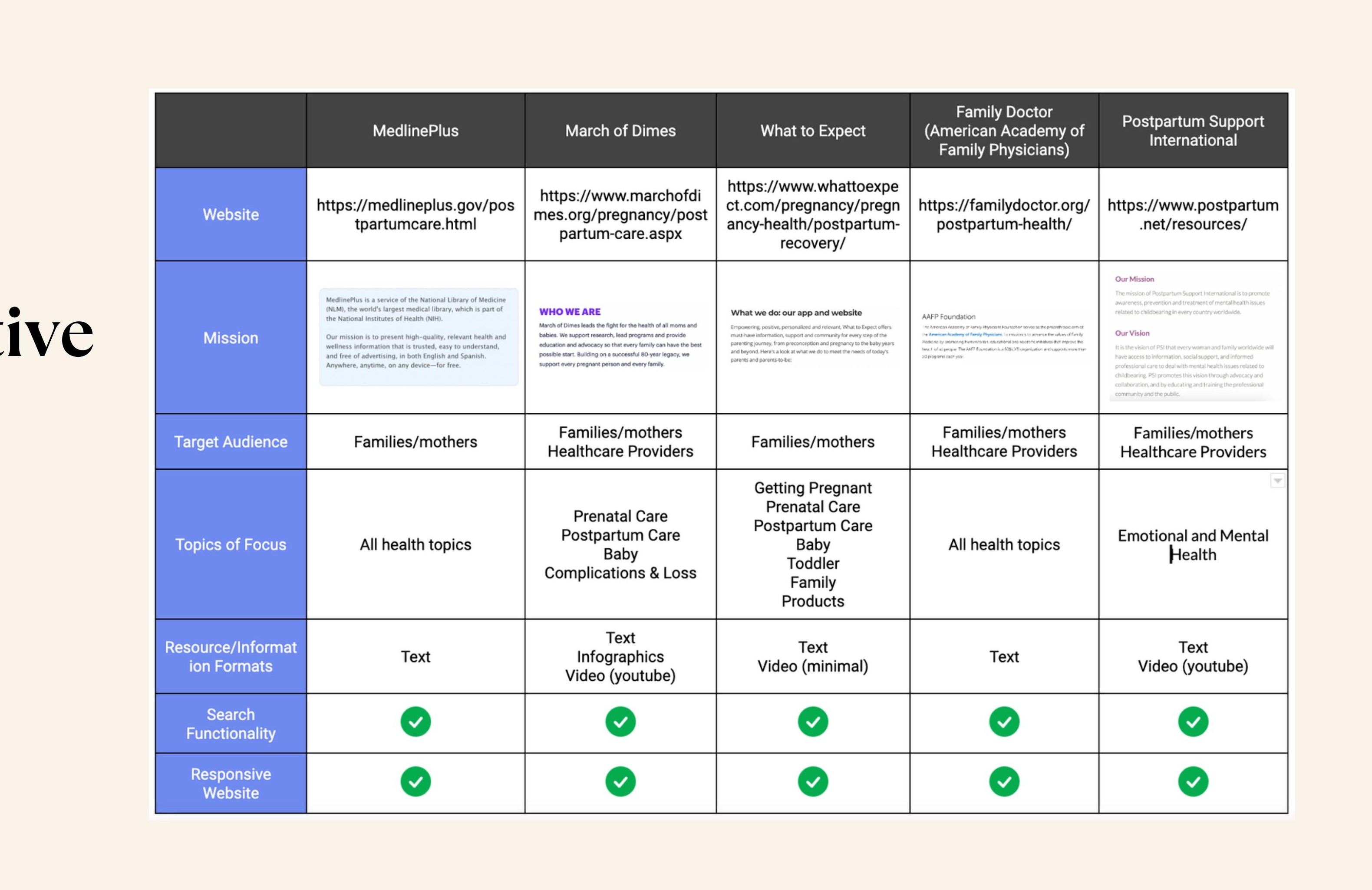
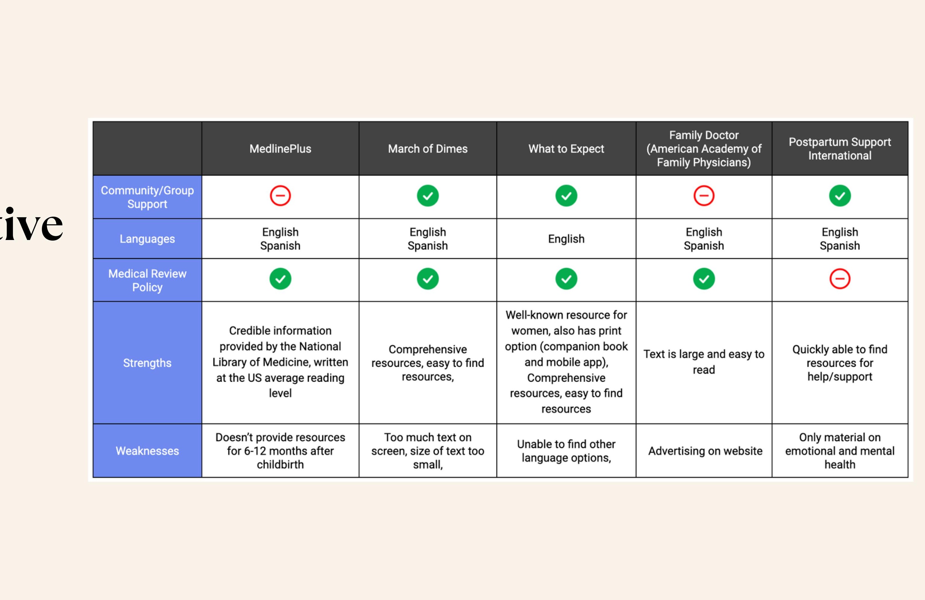
nobody had built something that centers the mother, not the baby. something that treats her recovery as the primary concern and gives her trusted, evidence-based guidance in real time.
research
i started with the question: what do mothers actually need, and when do they need it?
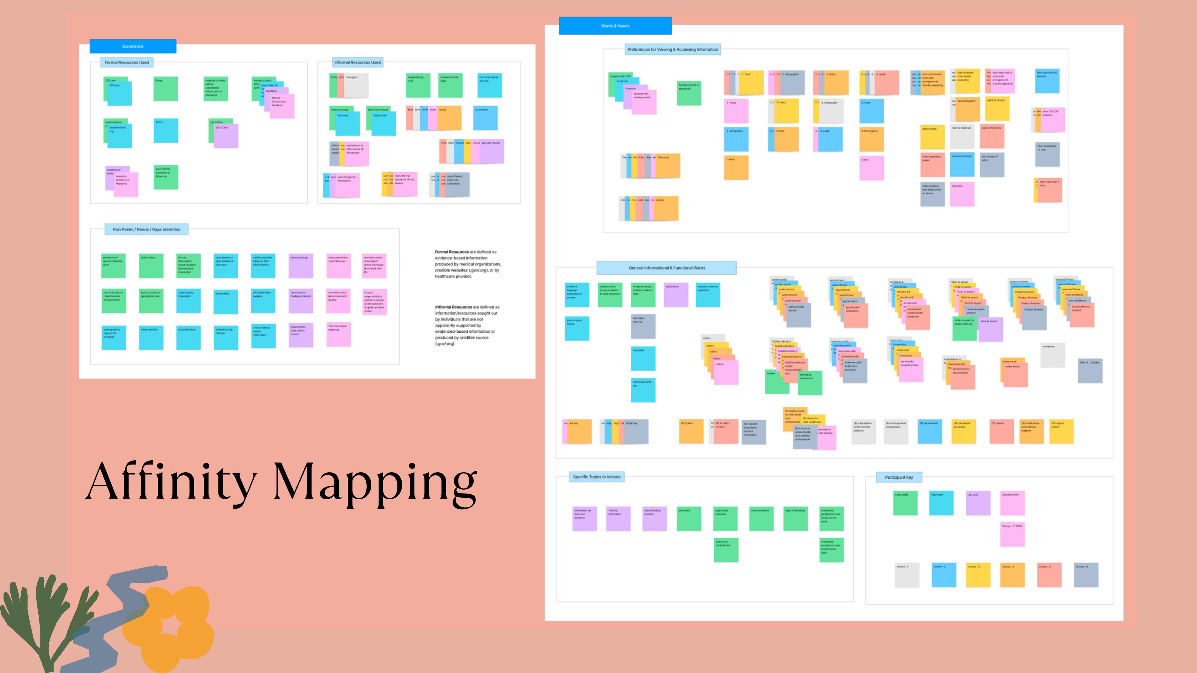
i interviewed postpartum mothers in depth, ran surveys on social platforms, and used card sorting to understand how they think about and prioritize postpartum information. the findings were consistent across every method.
on access. mothers want mobile-first, text-based information — clean, concise, easy to navigate, available on the device already in their hand. videos and infographics ranked second and third. the format preference maps directly to the context: one hand free, low sleep, low patience for friction.
on credibility. mothers were already turning to informal sources — friends, family, instagram, discussion forums — because formal resources felt distant or hard to find. the problem wasn't that credible information didn't exist. it was that informal sources were faster and warmer. any product would need to match that accessibility while providing evidence-based grounding those sources can't.
on willingness to pay. mothers said they would pay for access to a resource like this. the features they most wanted: "what to expect" articles, a patient portal, appointment scheduling, direct provider access, and emotional and mental health resources. that last item appeared consistently across interviews and the survey — it was the most underserved need in every existing product reviewed.
that last finding shaped everything. trust isn't built by piling on features. it's built in the way the product handles the first hard question a mother asks.
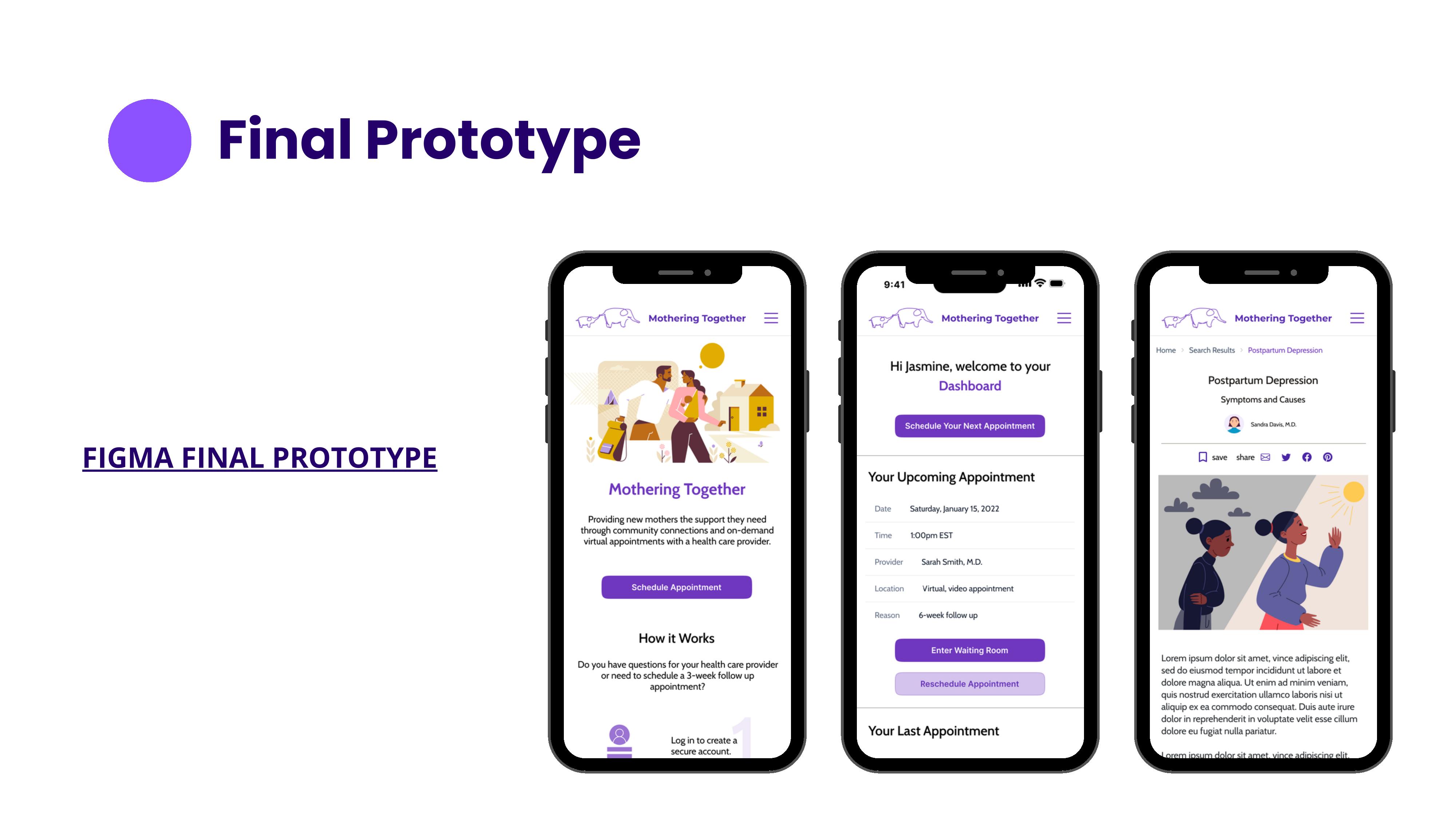
phase 1 — core product design
the first phase was a full ux design process for a mobile-first responsive website — from research through usability testing. this was the designlab ux certification capstone.
discover. i recruited 5 participants for video and in-person interviews, and distributed a survey on social media. the objectives were to understand how mothers prefer to find and receive information, what they'd been told (and what they wished they'd been told), what resources they used and where they fell short, and what gaps exist from the perspective of healthcare providers who are also mothers.
i also evaluated resources from acog, ahrq, and america's health rankings to map the clinical landscape — identifying that follow-ups are least common among women under 20, hispanic and latino women, and uninsured or publicly insured women.
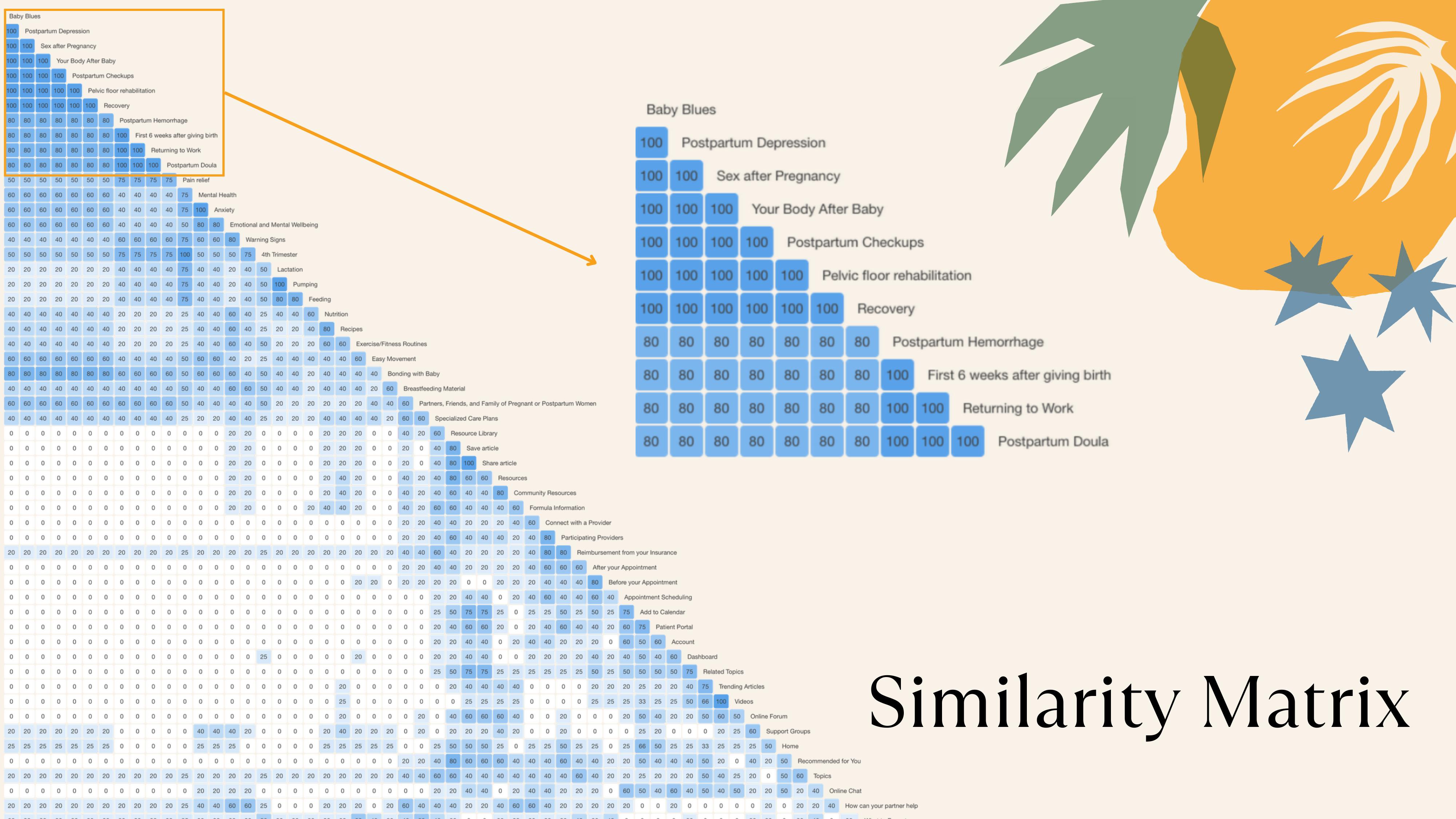
i ran a remote open card sort using optimal workshop with 56 postpartum topic cards. 5 participants completed the sort; 13 abandoned. the abandonment rate was itself a signal: 56 cards is too much cognitive load for a population that is sleep-deprived and overwhelmed by definition. that constraint became a design principle — the product cannot demand effort from the user. analysis of completed sorts used a similarity matrix and 3d cluster analysis. the results: 32 pairs were grouped together by all 5 participants, and the recommended grouping was 6 categories. participants consistently organized by urgency and personal concern — not by medical specialty. this directly shaped the information architecture, and the abandonment rate directly shaped how we think about interaction density across the product.
define. affinity mapping surfaced two core insights: availability of resources (time) and accessibility. from there, i wrote four point-of-view statements and generated how-might-we questions around direct provider access, quick access to evidence-based content, willingness to pay, and the problem of misleading information from informal sources like social media and family.
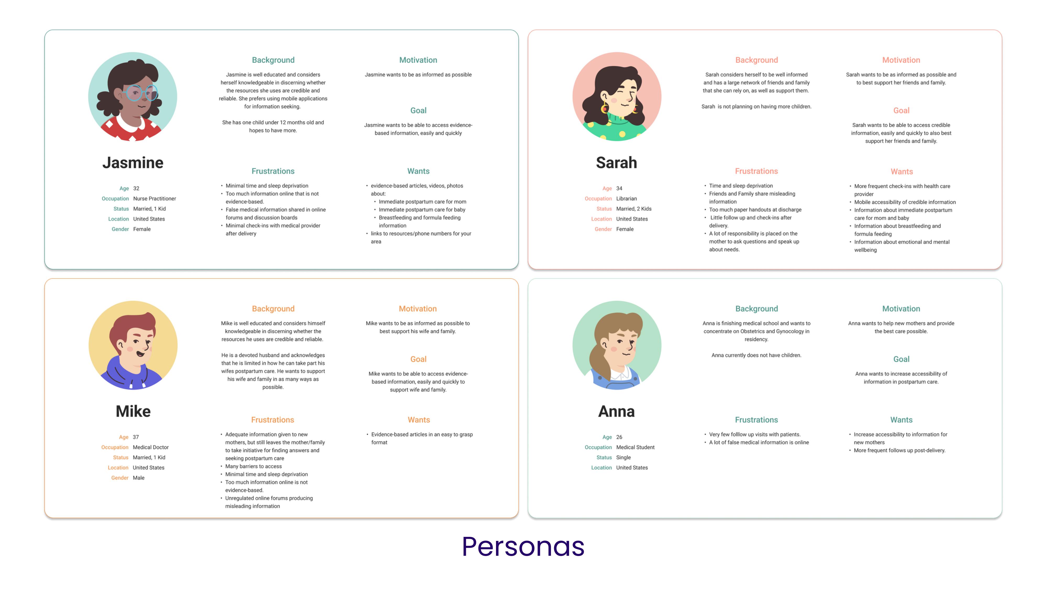
i created four user personas — a nurse practitioner, a librarian, a medical doctor, and a medical student — each representing a different relationship to postpartum information and different frustrations with the current landscape. a notable constraint of this phase: research participants were healthcare-adjacent. the live product has since been used and validated by actual postpartum mothers, and that experience has continued to inform the product's direction — particularly the tone of elle and the content areas users reach for first.
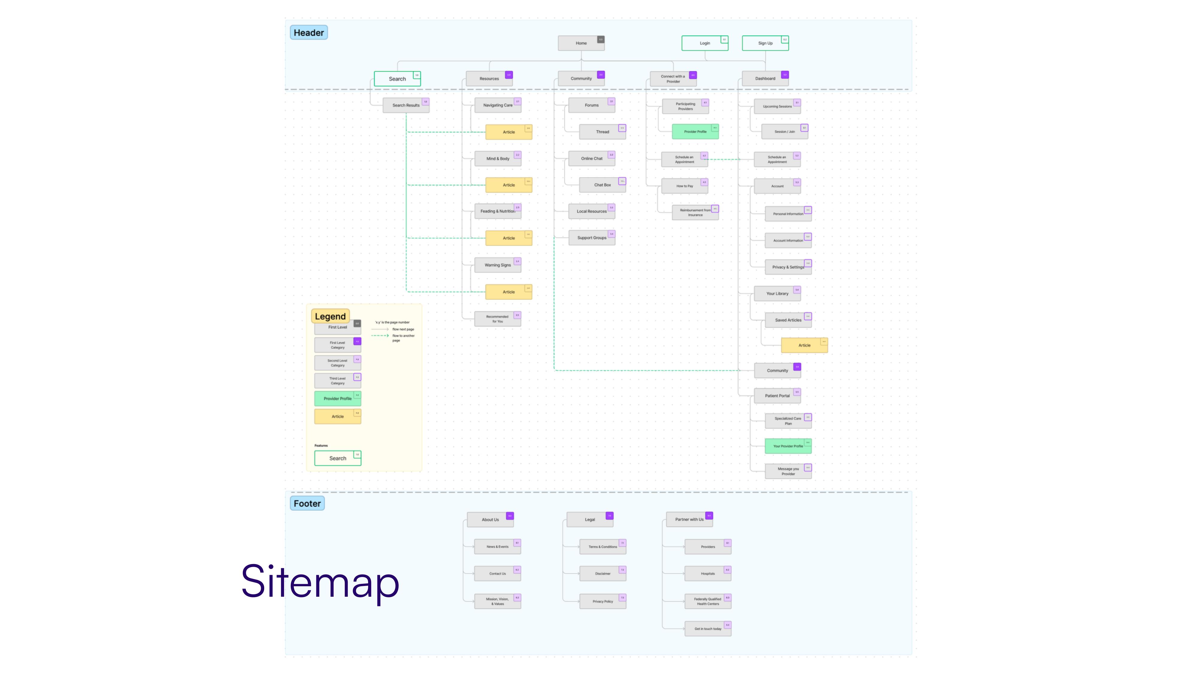
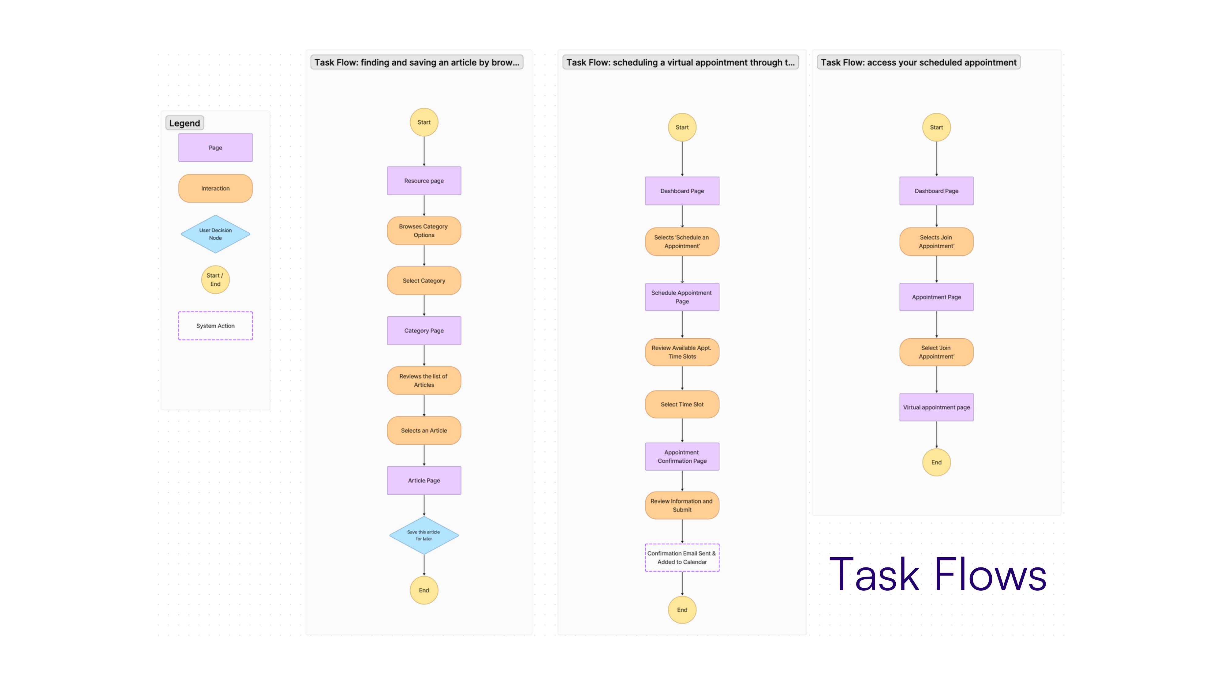
ideate. brainstorming through creative constraints and analogous inspiration led to two core features: (1) telehealth — the ability to schedule and join virtual appointments with a healthcare provider, and (2) a resource library — the ability to search, browse, and save evidence-based articles and media. storyboarding helped connect user needs to these solutions. i then built the sitemap and three task flows: finding and saving an article, scheduling a virtual appointment, and accessing a scheduled appointment.
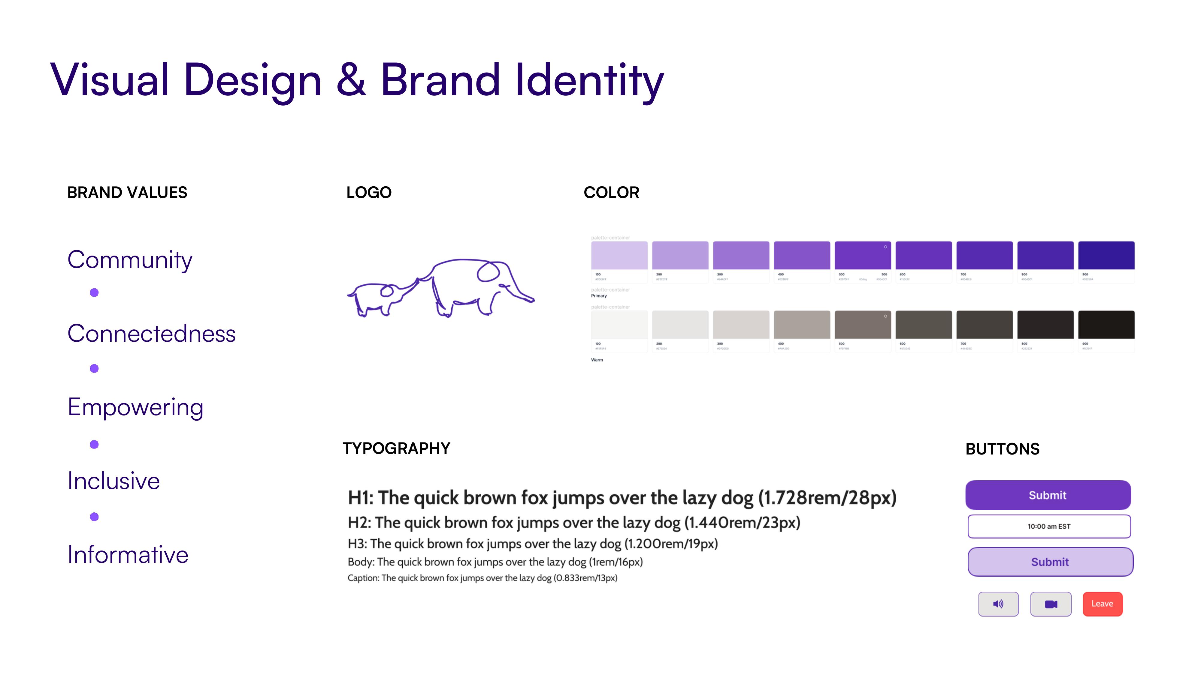
prototype. i sketched low-fidelity wireframes by hand, then moved to high-fidelity wireframes with brand identity work. the brand values — community, connectedness, empowering, inclusive, informative — shaped the visual direction: a purple palette, clean typography, and an elephant logo representing strength and memory.
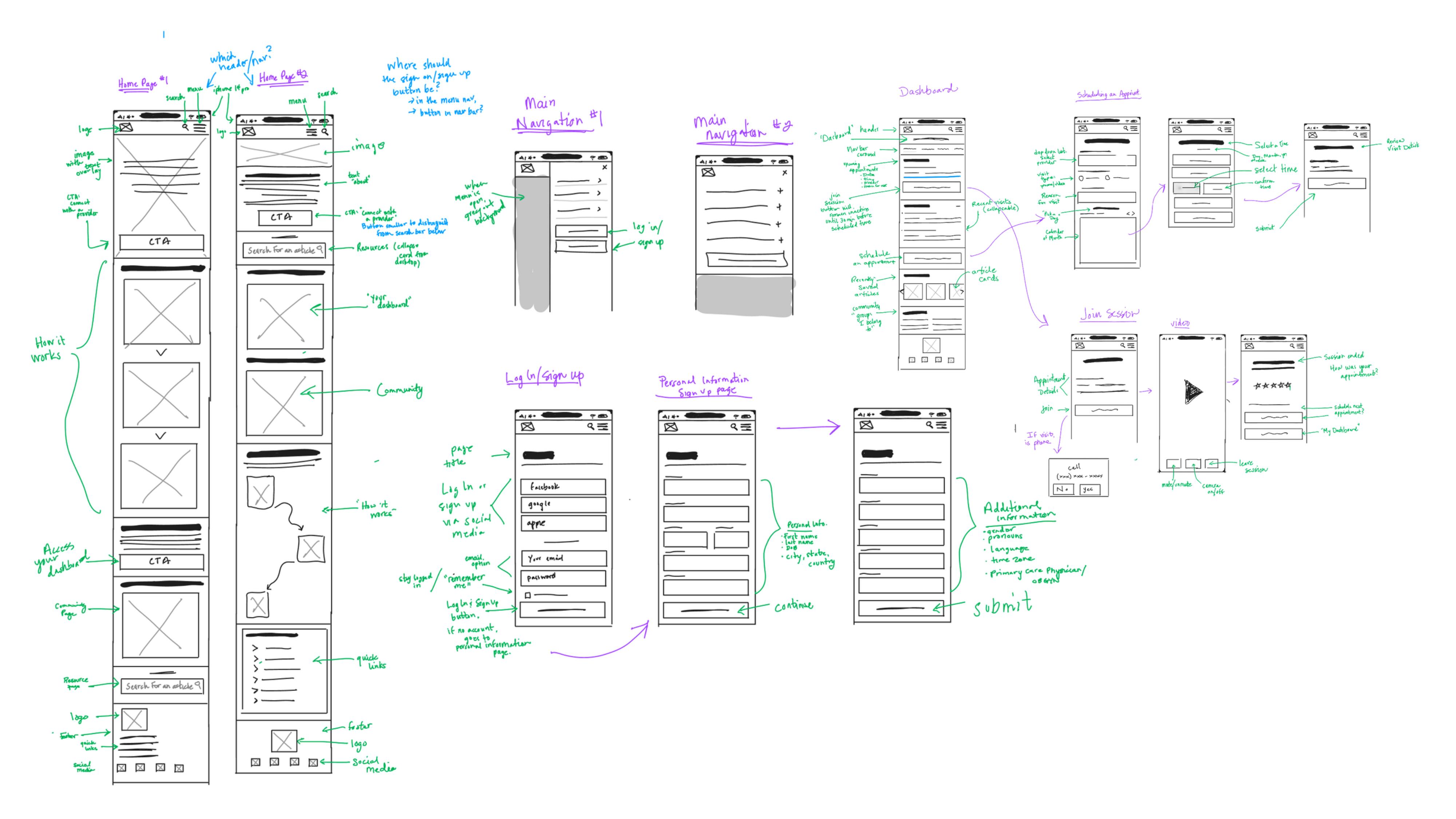
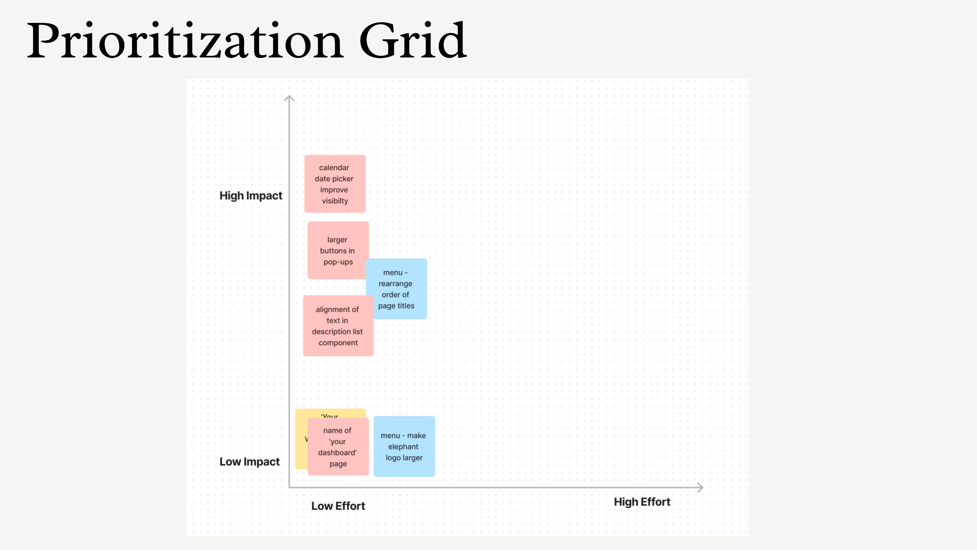
test. usability testing with 5 participants across the two primary task flows. all users completed each task in under 3 minutes. the main friction was accessing a scheduled appointment from the dashboard — users initially questioned the location, though most felt it was correct once they completed the task. other feedback: buttons on pop-ups needed to be larger, the menu page order needed reorganizing, and "your dashboard" should be renamed to "dashboard."
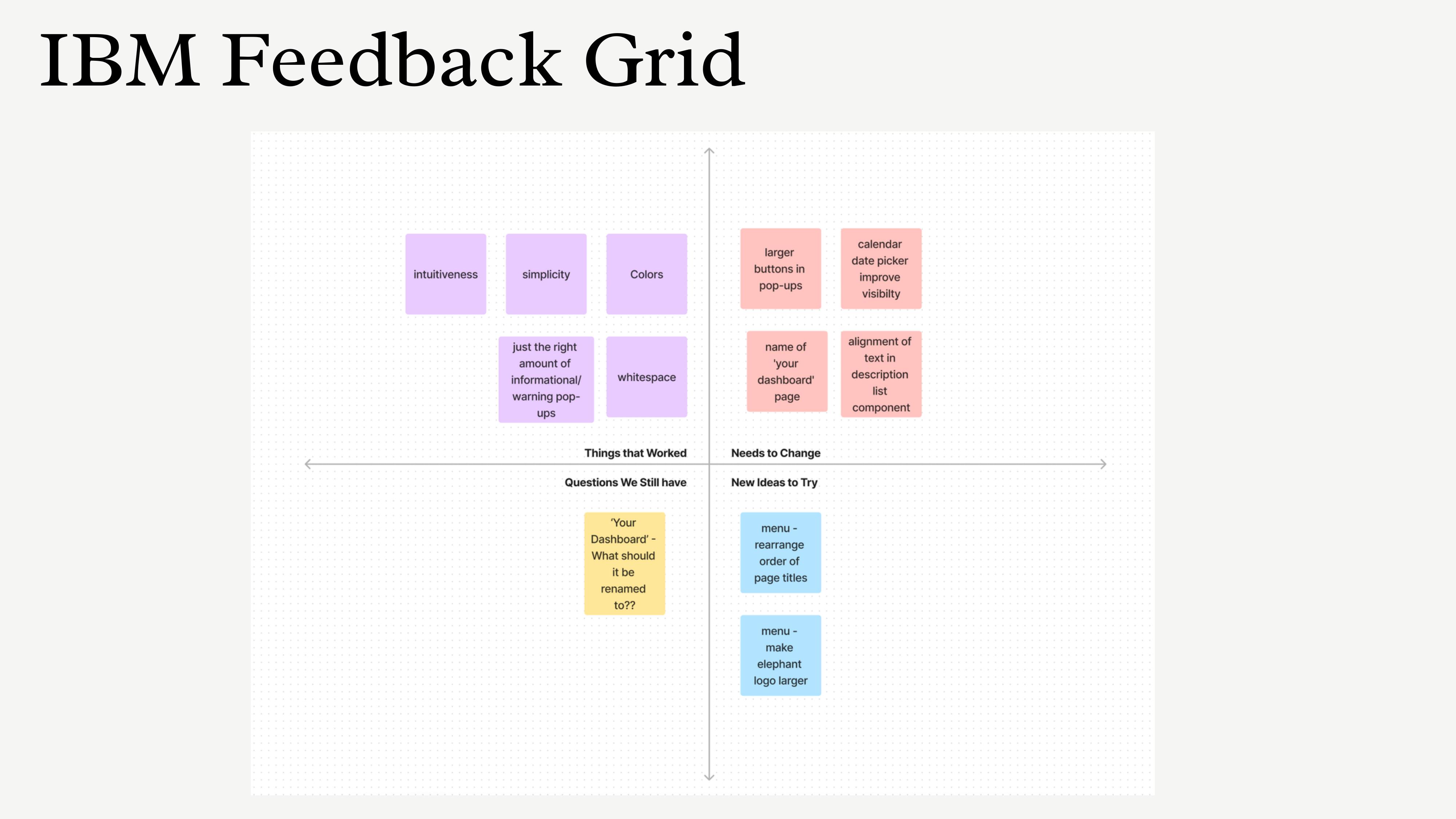
iterations were prioritized using an impact-vs-effort framework: increased button sizes on pop-ups, reorganized menu page order, and simplified the dashboard naming.
phase 2 — elle
phase 1 was the research and design foundation — a full ux process that established what mothers need and how they think about postpartum information. the live product is a different form factor built on the same core insight. where phase 1 designed for scheduled care (telehealth appointments, a resource library), phase 2 addresses what happens between appointments — the 3 AM question, the daily check-in, the moment when something feels wrong and there's no one to ask.
the second phase introduced elle, an ai companion providing personalized, evidence-based postpartum guidance. elle was designed to feel like a knowledgeable friend — conversational, warm, grounded in clinical evidence. not a chatbot.
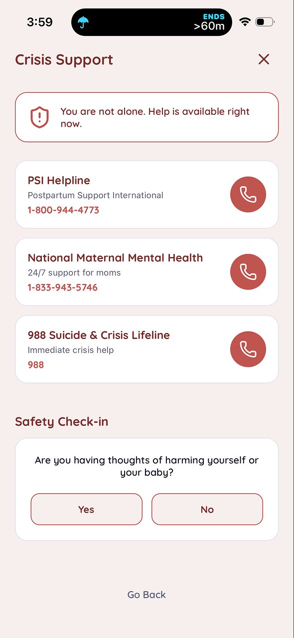
i designed the conversation ux, the prompt architecture, and the guardrails that keep elle within evidence-based guidance. the ai layer is powered by claude sonnet 4.6. elle includes a crisis and safety module and "is this normal?" coverage starting with physical recovery.
one of the more deliberate design decisions was the content labeling system: responses are visibly tagged as either "ai guidance" or "expert reviewed." this distinction matters. a postpartum mother asking about symptoms she's frightened by needs to know whether she's reading a model's interpretation or a clinically reviewed answer. the labeling isn't decorative — it's the product's trust mechanism made visible. elle also always shows a crisis resource button in the top corner, so no matter what a user is talking about, one tap gets them to help.
this design decision traces directly back to phase 1 research. one of the clearest POV statements from the original work: many mothers reach out to friends and family for postpartum information, and to social media and forums, because those sources are faster and warmer than clinical resources — but they frequently provide misleading or false information. the question was never how to make content more clinical. it was how to make credible information feel as accessible and trustworthy as a knowledgeable friend. elle's content labeling is the answer to that specific problem, four years later.
the deeper design challenge was ellememory — the system that lets elle store and retrieve longitudinal context across a mother's postpartum year. a mother who trusts elle through her first year creates a record of recovery, mood, sleep, and feeding that no other product owns. this isn't just personalization. it's the foundation for a product that gets better over time because it actually knows you.
technical decisions
the mvp was built on anything.com for speed — it handled frontend, backend, and data layer for the initial launch. i then migrated to vercel with supabase as the backend, using cursor agents for building and pushing to a github repo.
the migration was driven by a real constraint: the product needs hipaa-aligned infrastructure as it moves toward clinical workflows. vercel supports baas under a shared-responsibility model, which makes it a credible foundation for healthcare-sensitive data. payments run through stripe with a production webhook.
the design work that sits on top of the technical stack is where most of the decisions live: the prompt architecture that shapes how elle responds, the triage flow design that determines when elle escalates to crisis resources, the content guardrails that keep responses within evidence-based guidance, and the clinical-source validation process that backs every piece of content elle surfaces. these aren't engineering decisions. they're information architecture and conversation ux — the same discipline, applied to a new surface.
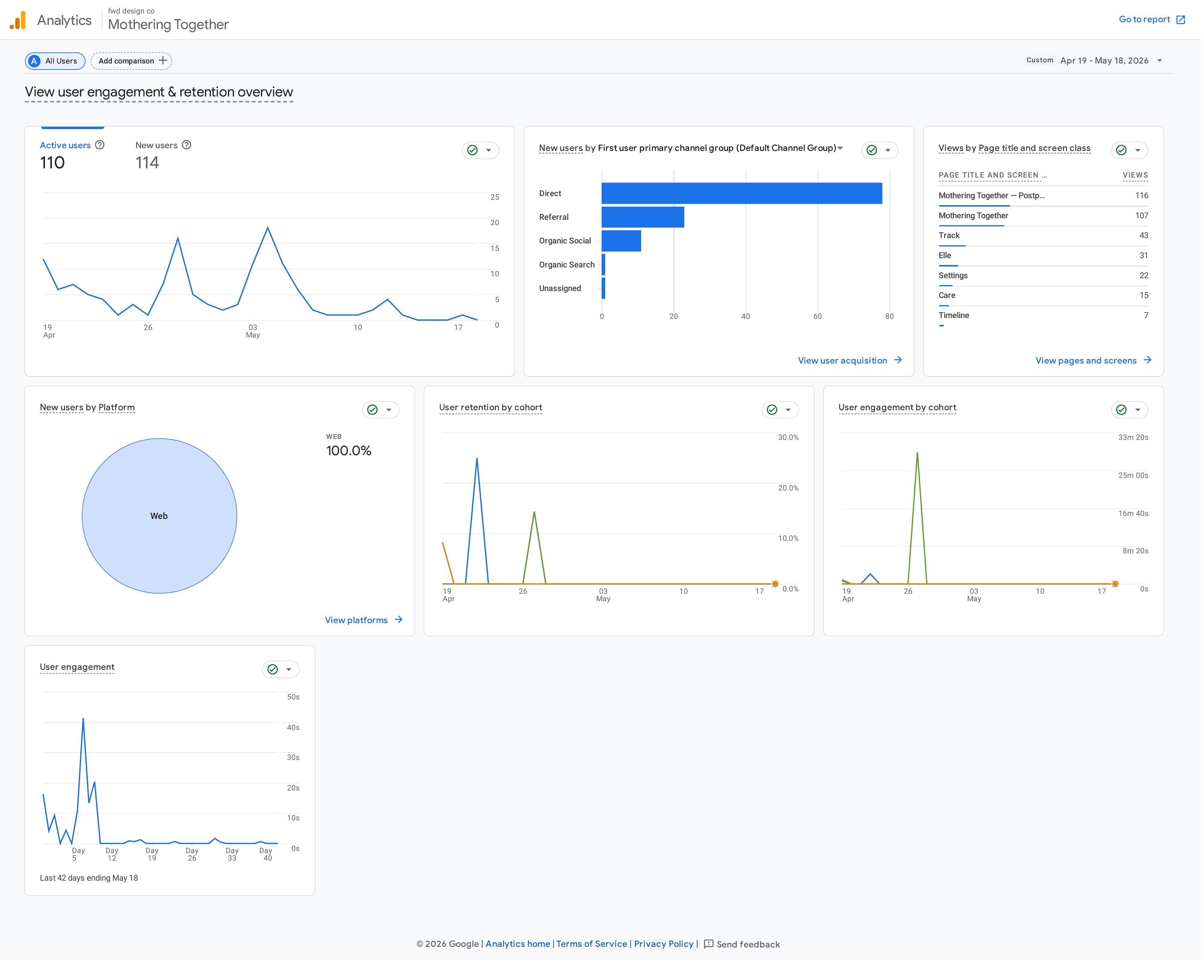
early results
in the first 30 days after launch, with no paid acquisition — just organic posting in postpartum communities and on social (threads, linkedin, facebook, x):
roadmap
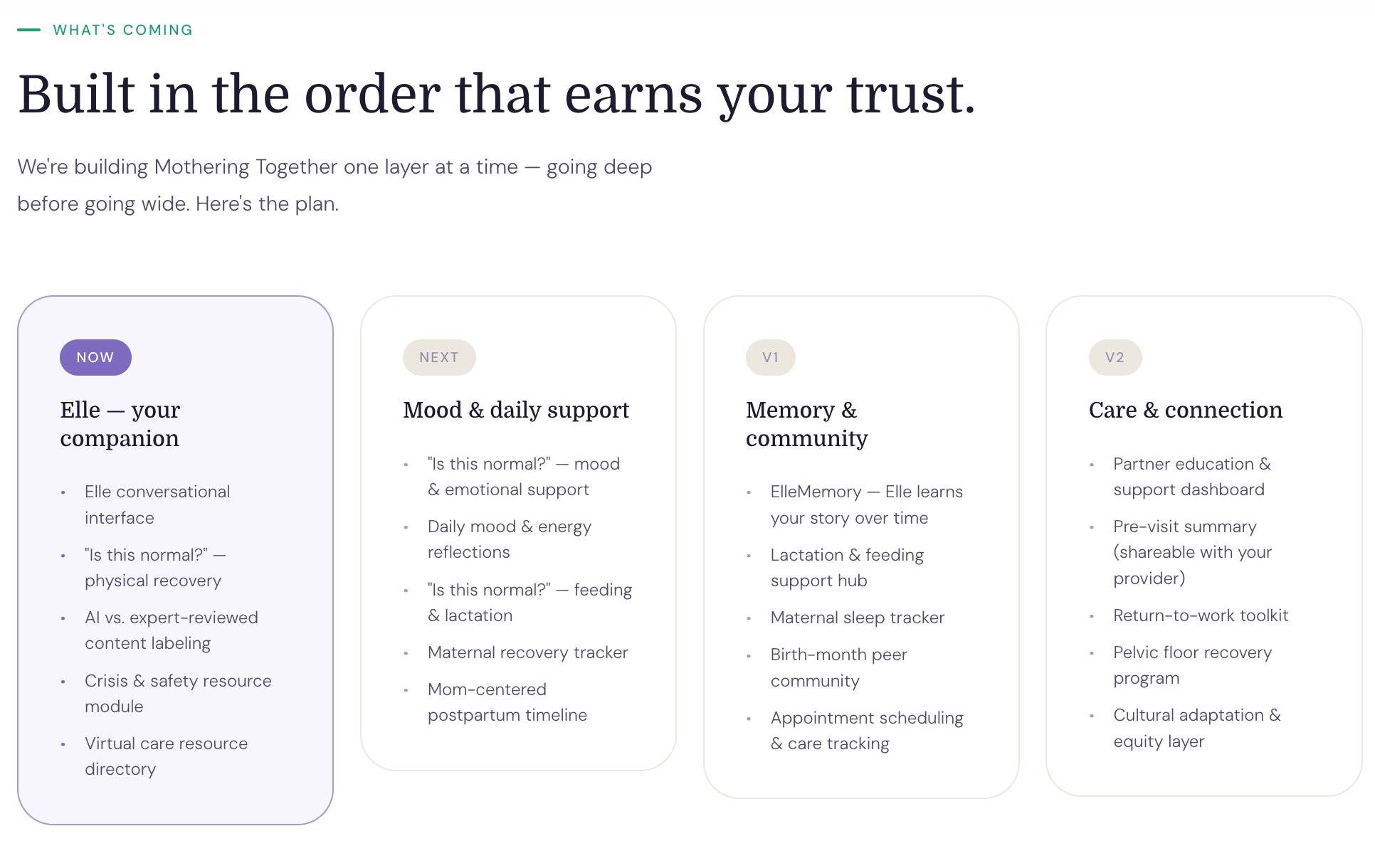
the roadmap is sequenced around trust. each layer adds depth only after the previous one has earned credibility with users.
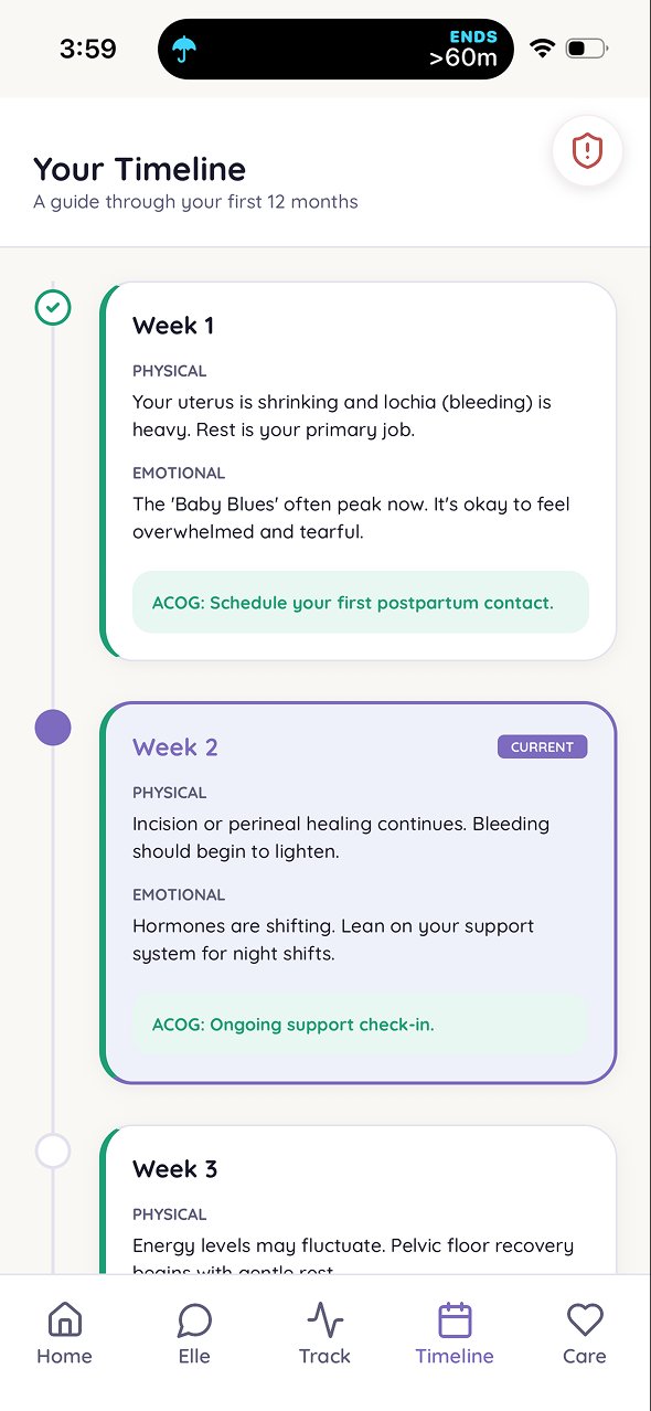
after physical recovery (live now), the next layers are: emotional and mood support, daily reflections, feeding and lactation support, a maternal recovery tracker, a mother-centered postpartum timeline, and a virtual care directory.
reflection
this is the project where everything i've done — library science, information architecture, hris, ux research — converges into a single problem worth spending years on.
the thing i keep coming back to: the way you organize information determines whether someone can use it. a clinical database and a postpartum app have different users, different contexts, and different stakes. but the underlying question is the same. can the right person find what they need, at the moment they need it most?
for mothering together, that moment is 3 AM, alone, with one hand free. and the answer has to be yes.