vein care associates
overview
After practicing in multiple states, a board-certified vein surgeon — anonymized here as Dr. Smith* — needed to establish a trusted digital presence in northern Michigan, not just open a physical location. I designed VeinCare Associates from research through launch: UX research, information architecture, responsive UI, and a full brand identity. The work started as my DesignLab UX certification capstone and became a fwd design co client engagement.
The site had to work for patients who arrive with symptoms, not vocabulary — "my legs hurt," not "chronic venous insufficiency." Card sorting and patient interviews shaped the structure from the start. Twenty topic pairs reached 100% agreement among card-sort participants. The site launched with a 4.9/5 patient satisfaction score.
A shorter business summary is published at fwd design co. *Name anonymized at the client's request.
the problem
Most medical practice websites are built around how doctors think about their services — by procedure name, by condition, by clinical specialty. Patients don't think that way. They think about pain, appearance, worry, and what happens next.
For a physician entering a new market, the website is the first trust signal. Prospective patients need treatment information before they're willing to book. Current patients need fast access to contact details, location, and the patient portal. Neither group should have to call the office to answer a question the site could handle.
I evaluated regional vein and vascular practices to map the competitive landscape. The pattern was consistent: credentials and procedure lists up front, patient concerns buried or absent. The opportunity was to organize content around how patients actually look for help — and to make online appointment scheduling the clearest path on the site.

discover
I started with the question: what do patients need from this site, and in what order?
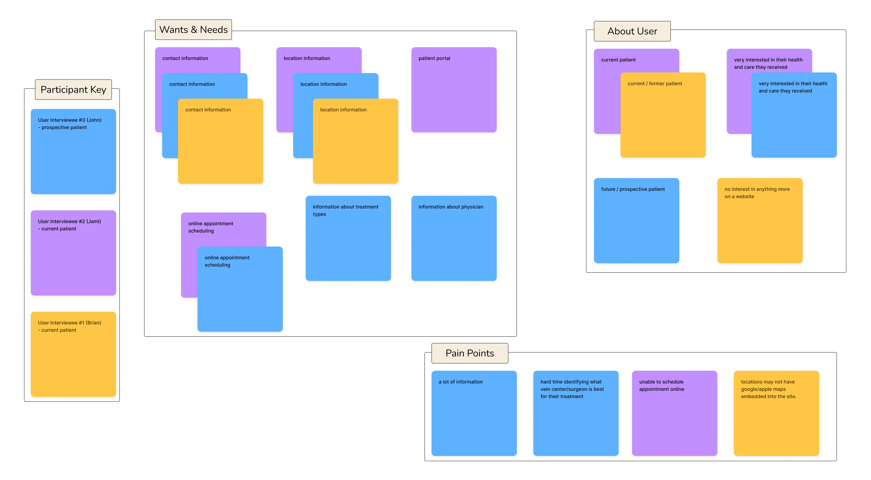
I conducted user interviews, distributed surveys comparing competitor websites, and ran a heuristic competitive analysis of national and local vein practice sites. Interview questions covered how patients find and select healthcare providers, what they found useful (or not) on existing vein surgeon websites, and where they expected to find specific information.
Affinity mapping surfaced five consistent themes across methods:
On referrals. Current patients were often referred by their primary care provider — they didn't seek out vein care on their own. Their primary concern was locating the practice, not evaluating treatment options.
On contact and location. Everyone wanted contact information and location details. Users expected a map on the location page and the ability to get directions without calling the office.
On scheduling. Users wanted the ability to schedule an appointment online. Both interviews and survey data ranked it as the highest-priority feature — above even vein disease and treatment information in the feature-ranking exercise.
On prospective patients. Future patients with vein symptoms wanted credible information about treatments, symptoms, and who to see — before committing to a consultation.
On language. Patients describe symptoms — heaviness, swelling, aching, cramping, restless legs — not clinical categories. Content had to meet them in that language first.
define
From the research, I wrote three point-of-view statements and how-might-we questions to frame the design work:
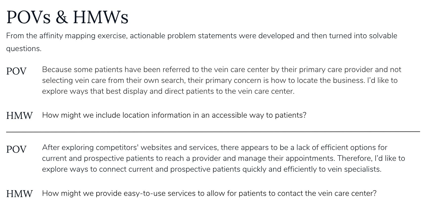
Location and referrals. Because referred patients aren't selecting vein care from their own search, their primary concern is how to find the practice. How might we display location information accessibly? How might we provide simple directions? How might we better inform referring physicians of the center's location?
Education before commitment. Prospective patients with vein symptoms have questions about treatments and who to see. How might we provide credible, easy-to-access information about vein disease? How might we use text, video, and images to display it for both current and future patients?
Connecting patients to care. Competitor sites lacked efficient ways for patients to reach a provider and manage appointments. How might we connect current and prospective patients quickly to vein specialists? How might we provide a personalized experience?
Those constraints became design principles: organize by patient concern, not clinical taxonomy; put scheduling one tap from anywhere; use plain language for clinical content; and separate "learn about my condition" from "manage my care."
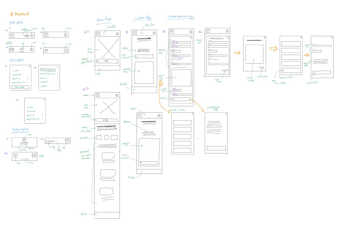
ideate — information architecture
I ran a remote open card sort in Optimal Workshop with 22 topic cards — covering treatments, vein disease, symptoms, scheduling, insurance, portal access, testimonials, FAQs, and more. Three participants completed the sort; twelve abandoned. The abandonment rate was a signal: even a focused card set demands too much effort for some users. That constraint shaped how I thought about interaction density on the finished site.
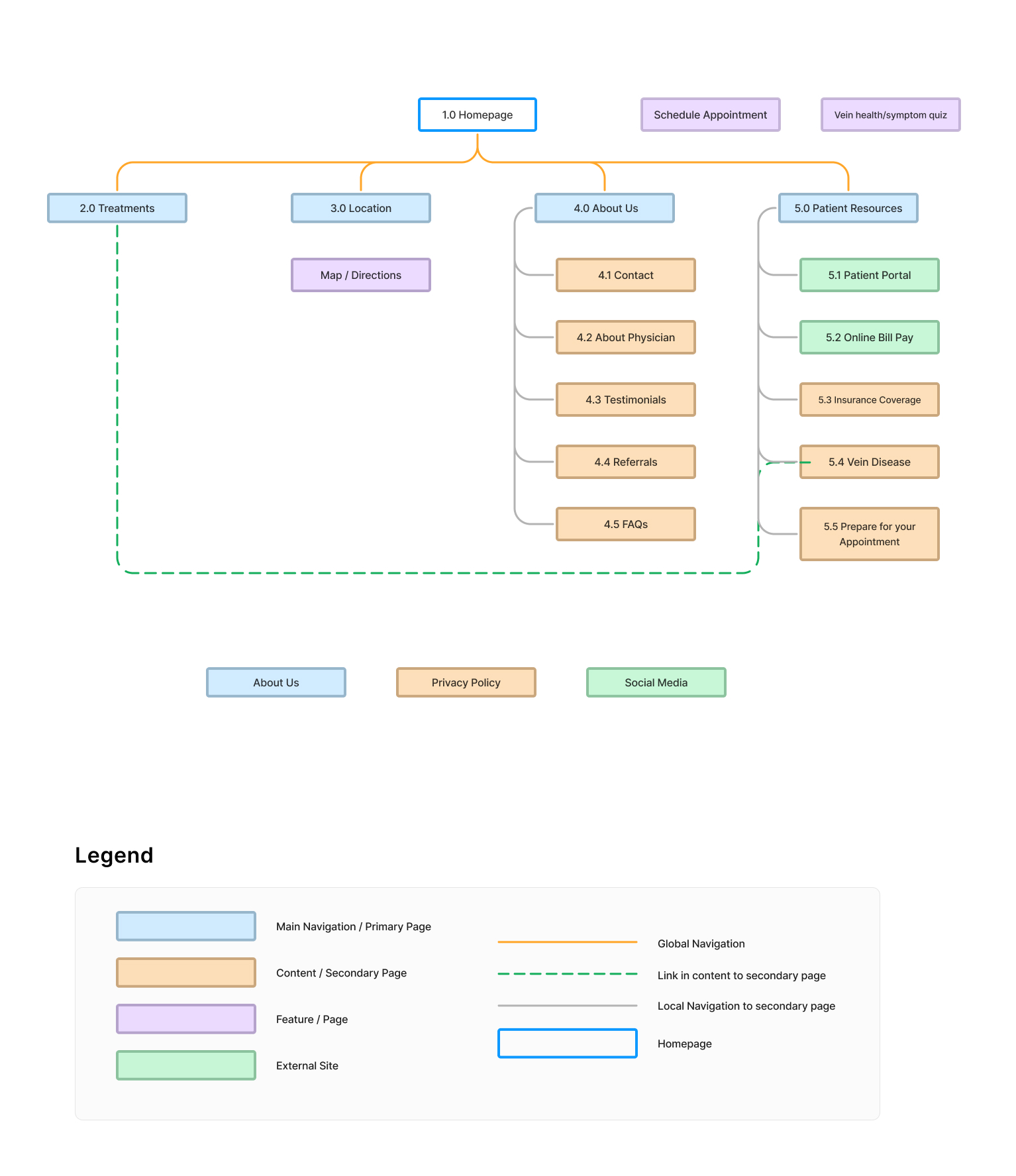
Among completers, 20 topic pairs were grouped together by 100% of participants. Thirty-seven pairs reached 66% agreement. Two clear categories emerged from participant-created groups: About Us and Patient Resources — which translated directly into top-level navigation. Online appointment scheduling ranked highest in the feature-ranking exercise, followed by vein disease and treatment information.
That research became the sitemap. Top-level navigation: Treatments, Location, About Us, and Patient Resources — with Schedule Appointment and a vein health symptom quiz as persistent features. Patient Resources holds educational content (Vein Disease, Insurance Coverage, Prepare for Your Appointment) while Treatments cross-links to condition information where clinical and patient language meet.
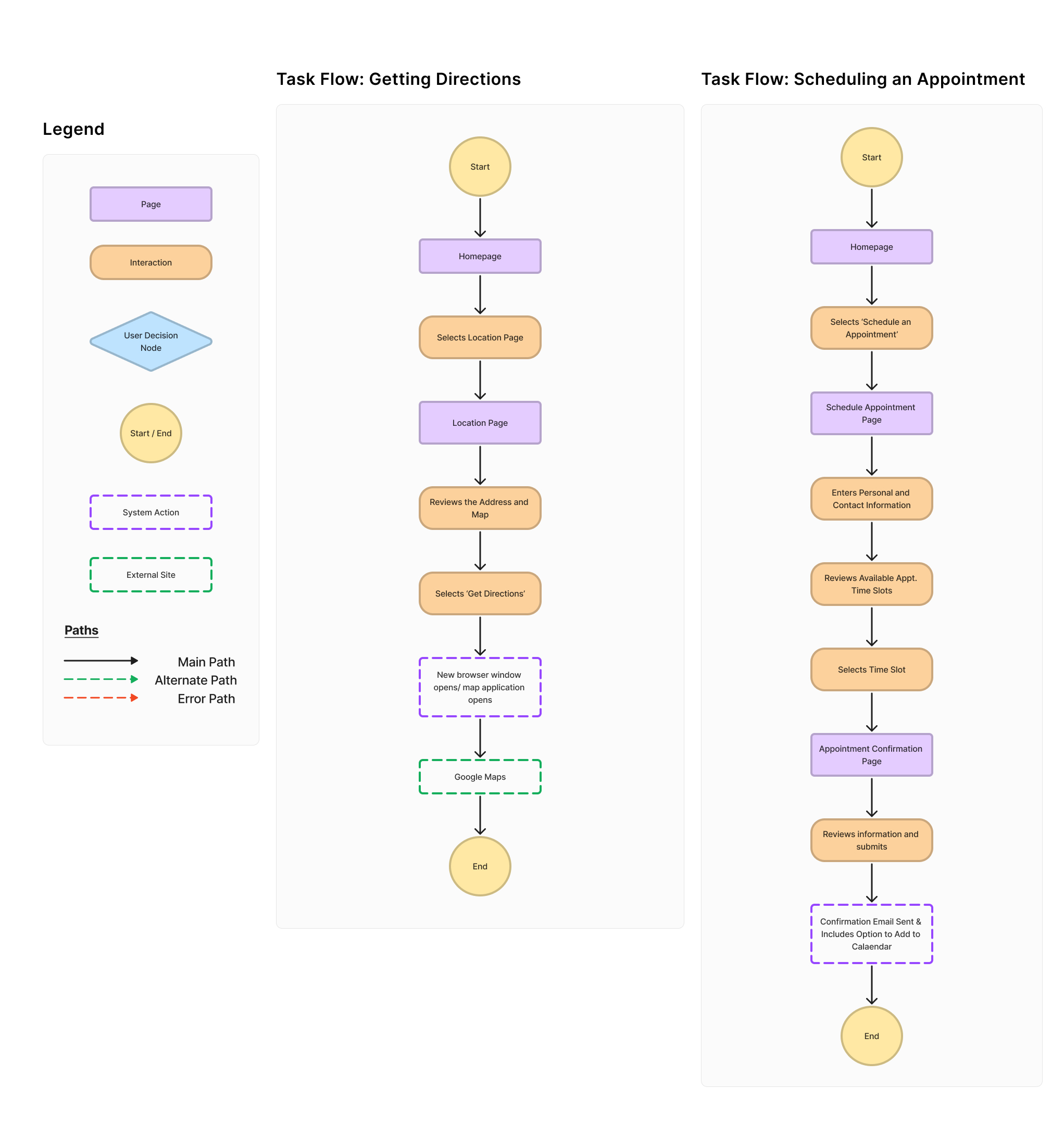
From the sitemap, I mapped two core task flows:
Getting directions. Homepage → Location → review address and map → Get Directions → external maps application. Straightforward, high-frequency, especially for a practice new to the area.
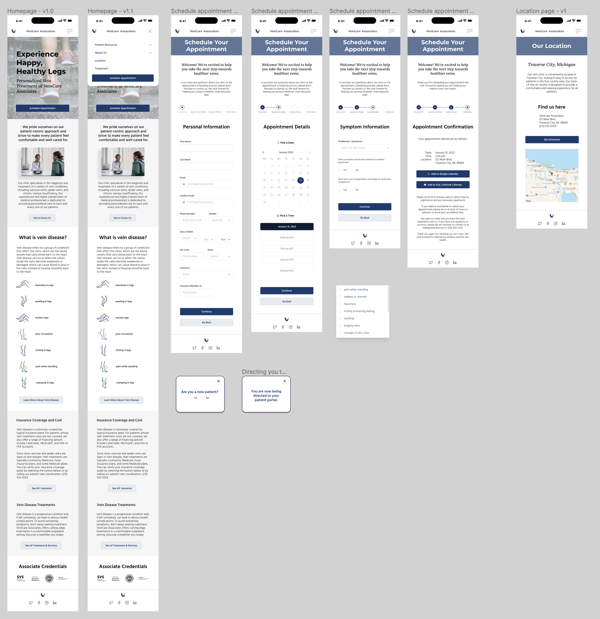
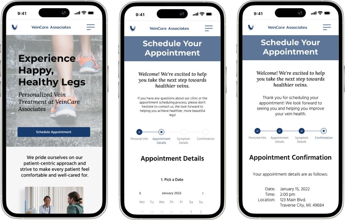
Scheduling an appointment (new patient). Homepage → Schedule Appointment → personal information → pick a date → select a time slot → symptom details → confirmation with calendar add. A multi-step flow that gathers essential clinical context without overwhelming someone who hasn't committed yet.
prototype — design & brand
I sketched low-fidelity wireframes by hand from the task flows — location page, appointment scheduling steps, confirmation — then moved to mid- and high-fidelity screens in Figma. Low- and mid-fidelity wireframes let me iterate quickly before committing to visual design.
Brand identity work ran in parallel. The practice needed to feel trustworthy and state-of-the-art without reading as clinical or salesy. Brand values: trustworthiness, excellence, compassionate, patient-centered. The visual system used navy (#173B6C) as primary, supporting blues (#5D7698, #C5CEDA), sage green (#A6CF8B) for symptom icon accents, and Montserrat, Lora, and Hind Madurai for the type hierarchy.
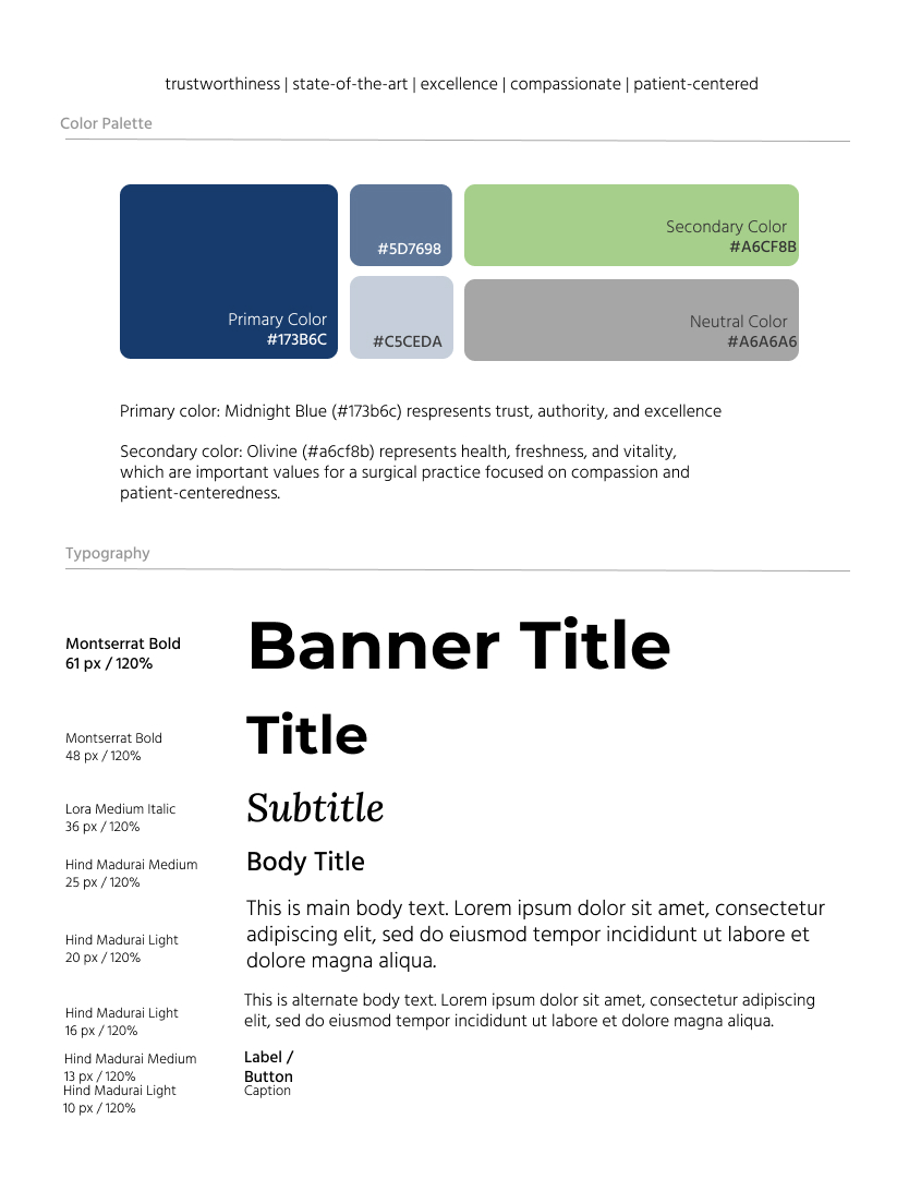
The logo went through hand-drawn sketches, client-selected favorites, and color refinement iterations before landing on the final VeinCare Associates mark — a folded-ribbon "V" in navy and blue-grey.
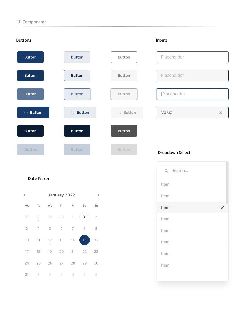
I built a UI component library — buttons, inputs, date picker, dropdown select — so the scheduling flow and forms would behave consistently across breakpoints. The homepage hero — "Experience Happy, Healthy Legs" — leads with patient outcome language. Below it, a "What is vein disease?" section uses custom symptom icons (heaviness, swelling, restless legs, aching, cramping) so patients can self-identify before reading treatment detail.
test
I ran quantitative and qualitative usability testing on the high-fidelity mobile prototype using Maze — two prototype tests, each followed by an opinion scale question and open-ended feedback.
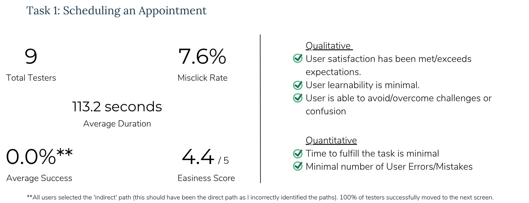
Task 1 — Scheduling an appointment. Nine testers completed the multi-step booking flow with a 4.4/5 easiness score, 7.6% misclick rate, and an average duration of 113.2 seconds. The reported 0% direct-path success rate was a path-labeling error in Maze — all nine testers successfully advanced through each screen. The real friction was accessibility and form clarity, not flow logic.
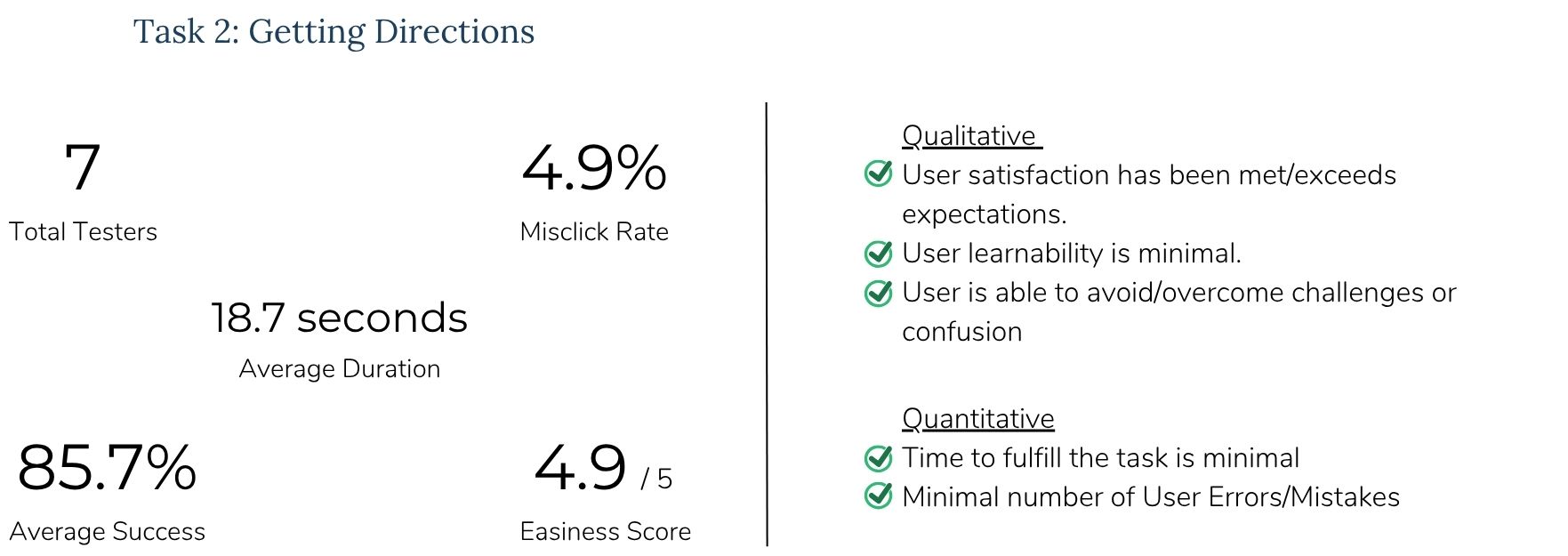
Task 2 — Getting directions. Seven testers completed the flow with an 85.7% direct success rate, 4.9/5 easiness score, 4.9% misclick rate, and an average completion time of 18.7 seconds. All success metrics passed: satisfaction met or exceeded expectations, minimal learning curve, minimal errors.
I synthesized findings using IBM feedback and prioritization grids. All testers described the design as clean, professional, and easy to navigate. One tester put it directly: "Positive, smooth, easy. Ready for my new vein!" High-impact, low-effort fixes clustered around accessibility: increase font size, darken input field borders (greyed-out fields looked inactive), enlarge radio button touch targets to 48×48px on mobile, remove hover states on mobile, and darken the menu icon.
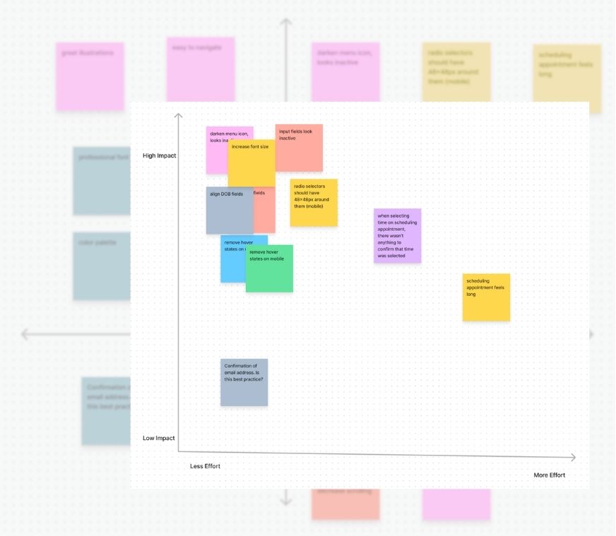
Iterations shipped before launch: increased body and label font sizes across the homepage and scheduling flow; darkened form input borders so fields no longer looked inactive; improved time-slot selection feedback so users could confirm their choice. Scheduling still felt long to some testers — a tradeoff I accepted because gathering symptom context upfront reduces back-and-forth at the office.
results
The site launched with strong patient reception and measurable operational impact for the practice.
Patients could find treatment information, book appointments, and get directions without calling the office. Staff time shifted from answering repetitive questions to patient care. For a physician establishing credibility in northern Michigan, that combination — accessible information plus a professional, patient-centered experience — was the point of the project.
roadmap
With the core site in place, the next layers focus on accessibility and engagement:
Virtual consultations — reach patients who can't travel to the clinic for an initial conversation about their symptoms.
Live chat / online messaging — real-time support for patients who have questions after reading site content but aren't ready to book.
reflection
This project reinforced something I've believed since my library work: the way you organize information determines whether people can use it. A patient website and a clinical database have different users, different contexts, and different stakes — but the underlying question is the same. Can the right person find what they need?
For elective specialty care, that question arrives at first contact. A patient with leg pain isn't browsing procedures — they're deciding whether this practice understands their problem before they pick up the phone. Card sorting gave me the structure. Usability testing caught the accessibility gaps. Launch satisfaction told me the whole system held up outside the prototype.
User needs ended up different than what I'd hypothesized at the start. Simpler was almost always better. And capturing design problems early — in research, not after launch — saved iteration cycles I didn't have as a solo designer on a client timeline.